It is essential to have a responsive website in the modern digital world. A responsive website will work and look great on all kinds of devices if someone is using smartphones and desktop computers. This tutorial will take you step-by-step through the whole process of building a responsive website, from coding and testing to planning and design.
How to Create a Responsive Website
To create a responsive website you need a good knowledge of coding and designing. To create a responsive website follow these guidelines. This website would be responsive and user-friendly.
1. Understanding Responsive Web Design
A design that gives the best experience to users on all types of devices ranging from mobiles, laptops, and desktops. Responsive web design is a design approach aimed at creating websites that provide an optimal user experience across a wide range of devices, from desktop computers to mobile phones. It is the fittest in all the screen sizes. This ensures that the site is user-friendly and functional, enhancing user engagement and satisfaction.
Why User Experience Matters
- Increased Conversions: A positive user experience leads to higher conversion rates, whether it’s making a purchase, signing up for a newsletter, or completing a form.
- Improved Brand Reputation: Satisfied users become brand advocates, sharing positive experiences with others.
- Higher User Retention: Good user interface promotes the users for repeat visits of your site.
- Better Search Engine Rankings: Search engines prioritize user-friendly websites, which can boost your visibility.
Improving User Experience Through Responsive Design
- Mobile-First Approach: Make your mobile experience better. This will increase your ranking among mobile users.
- Fast Loading Times: Optimize images and code for faster load times, especially on mobile devices.
- Intuitive Navigation: make navigation easy. Show menus and labels clearly and they will adapt easily in different screen sizes.
- Clear Call-to-Actions: Make it obvious what you want users to do with prominent and well-placed CTAs.
- Optimal Typography: Choose readable fonts and adjust font sizes for different screen sizes.
- Touch-Friendly Interactions: Design elements that are easy to tap on mobile devices.
- Consistent Experience: Your website looks similar on all devices.
- Test Thoroughly: Continuously test your website on various devices and screen sizes to identify and fix issues.
How to track user experience
- Bounce Rate: A website’s “bounce rate” is the percentage of visitors who depart after a certain amount of time. It will not take any action.
- Conversion Rate: Check how much percentage of users are doing some action like subscribing, adding some item to the cart, and something others.
- Time on Site: Track the average time visitors spend on your site. list the top articles on your site.
- Mobile Conversion Rate: The conversion rate specifically for mobile users.
If you focus on user experience and apply responsive web design principles, Your website not only looks better but also give satisfaction and increase engagement of customers.
It’s possible to design websites that not only look amazing but also increase user pleasure and engagement by putting responsive design concepts into practice.
2. How to plan a website
Creating a successful website requires careful planning.
1. Define Your Goals and Target Audience
What is the primary purpose of your website?
Before starting work on design First make sure the purpose of your website. Whether it’s to showcase a portfolio, sell products, share content, provide information, or build a community. having clear goals will guide your design and development process.
Who is the audience of the website?
Clearly define your target audience’s demographics, interests, and online behavior. Understand the preferences, behaviors, trends, and needs of your target audiences. This research will help tailor your website’s design to meet user expectations effectively.
2. Conduct Competitor Analysis
Study your competitors’ websites to identify trends, strengths, and weaknesses. This analysis can inspire your design and functionality choices, helping you stand out in the market. Find opportunities to differentiate your website.
3. Choose a Domain Name and Hosting
Your domain name reflects your brands and it should be simple and easy to remember. Choose a reliable hosting provider that offers features suitable for your website’s needs.
4. Create a Site Map
Determine the main pages and how they will be linked together. Ensure a logical flow for users. Make a category and subcategory according to your needs. Show your services and products in a manageable way.
7. Choose a Website Platform
Choose a CMS according to its utility, knowledge, and skillset. Consider options like WordPress, Wix, Shopify, Squarespace, or custom development. Evaluate the ease of use related to your skill set. Consider the features and cost of the platform when selecting the right one.
3. Designing for Responsiveness
Wireframing and Mockups
Start with wireframes to outline the basic structure of your website. Tools like Balsamiq or Adobe XD can help you create low-fidelity mockups. These sketches will serve as a blueprint for your design.
Design Principles
Focus on simplicity, usability, and consistency. Make use of simple navigation, a clear call to action, and a tidy layout. Avoid clutter and ensure your design is visually appealing and functional.
Choosing the Right Tools
Select design tools that fit your workflow. Popular choices include Adobe XD, Figma, and Sketch. These tools offer features that streamline the design process, from wireframing to prototyping.
4. Development Tools and Techniques
HTML and CSS Basics
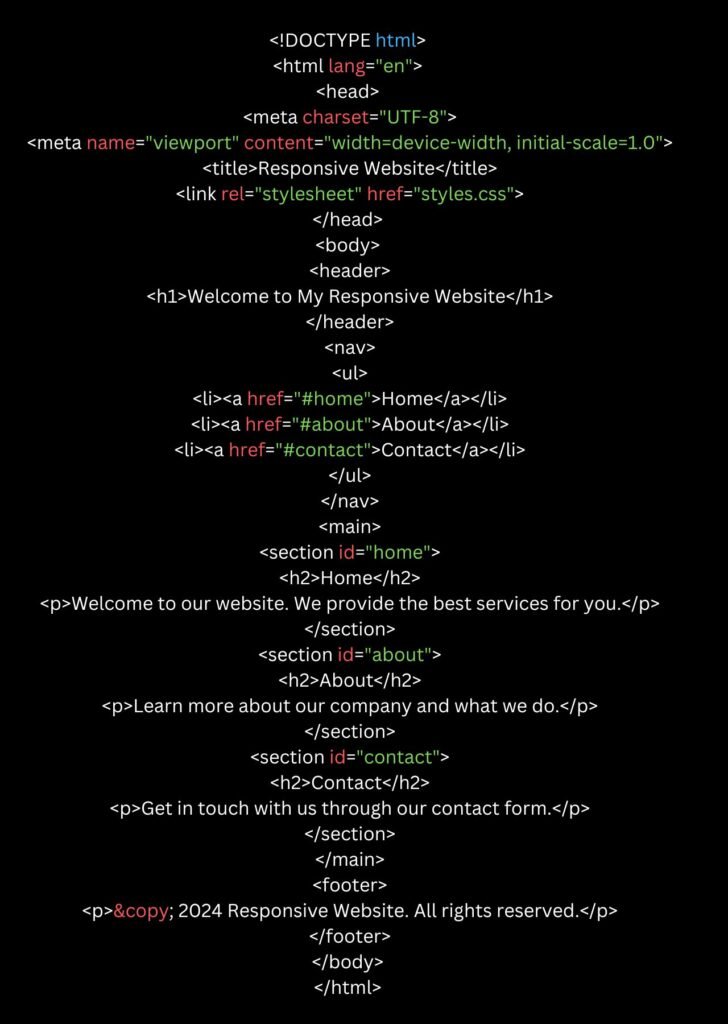
Start your work with HTML for structure and add CSS for styling. Use semantic HTML it promotes the accessibility and SEO of your site. Here’s a basic HTML5 template:

Responsive Frameworks (Bootstrap, Foundation)
Frameworks like Bootstrap and Foundation simplify the process of creating responsive websites. They offer pre-designed components and a grid system that adapts to different screen sizes.
Media Queries and Flexbox
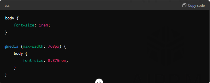
Utilize CSS media queries for styles. This will be based on the characteristics of the devices. Flexbox simplifies the layout design, making it easier to create flexible and responsive layouts.

5. Creating Responsive Layouts
Grid Systems
Utilize CSS Grid Layouts to create complex, responsive designs with ease. The grid layout is powerful for building multi-column layouts that adapt to various screen sizes.

Fluid Grids
A fluid grid uses percentages instead of fixed pixels for widths, allowing content to resize fluidly across different screen sizes.

Responsive Images
Use the `srcset` attribute in HTML to provide different image sizes for different screen resolutions. This ensures images load quickly and look sharp on all devices.
6. Advanced Techniques for Responsiveness

CSS Grid vs. Flexbox
Both CSS Grid and Flexbox are essential for modern layout design. While CSS Grid is ideal for complex layouts, Flexbox excels in one-dimensional layouts. Choose based on your specific needs.

Responsive Typography
Responsive typography is the practice of designing text that automatically adjusts its size, spacing, and other attributes to fit seamlessly on different screen sizes and devices. It’s a crucial component of responsive web design, ensuring optimal readability and visual appeal across platforms.

Key Elements of Responsive Typography:
- Font Size: Adjusting the text size to accommodate smaller screens while maintaining legibility.
- Line Length: Optimizing line length for easy reading on different screen widths.
- Font Scaling: Using relative units (like em or rem) for font sizes to maintain proportions across different screen sizes.
- Media Queries: Using CSS media queries to apply specific typography styles based on screen width.
- Line Height: Adjusting line spacing for better readability.
- Letter Spacing: Fine-tuning letter spacing for improved clarity.
Benefits of Responsive Typography:
- Improved Readability: Ensures text is comfortable to read on any device.
- Enhanced User Experience: Provides a consistent and visually pleasing experience.
- Better Accessibility: Makes content accessible to users with visual impairments.
- Increased Engagement: Keeps users engaged by delivering optimal content presentation.
Use relative units like `em`, `rem`, and `%` for font sizes to ensure text scales appropriately across different devices.
Performance Optimization
To decrease the loading time optimize images, minify CSS and JavaScript files, and leverage browser caching. This will improve your website’s loading speed. Use Tools like Google PageSpeed Insights and Gtmatrix can help you identify and fix performance issues.
7. Testing and Debugging
Browser Compatibility Testing
Use tools like BrowserStack or CrossBrowserTesting to check how your site appears on different browsers and devices. Ensure consistency in design and functionality.
Device Testing
Test your website on actual devices or use emulators to simulate various screen sizes and resolutions. This helps identify issues that might not be visible on desktops.
Performance Testing
Evaluate your website’s performance using tools like GTmetrix or Lighthouse. Optimize assets and improve loading times based on the feedback.
8. Deploying Your Responsive Website
Choosing a Hosting Provider
Select a reliable hosting provider that supports responsive websites. Popular choices include Bluehost, SiteGround, and AWS.
Domain Name Selection
Choose a domain name that is short, memorable, and relevant to your brand. Use GoDaddy or Namecheap to register your domain.
Launch Checklist
Before going live, ensure all functionalities work correctly, the site is optimized for SEO, and all content is proofread. Create a checklist to cover all aspects of the launch process.
9. Maintenance and Updates
Regular Updates
Keep your website content and software up-to-date. Regularly update your plugins. Improve security and user experience of your site.
Security Practices
Implement security measures like SSL certificates, regular backups, and secure passwords to protect your website from threats.
Analyzing User Feedback
Examine user comments to determine what needs to be improved. Utilize programs such as Google Analytics to monitor user activity. Make choices that will increase traffic and revenue.
10. Case Studies and Success Stories
Examples of Successful Responsive Websites
Study successful responsive websites to understand what makes them effective. Analyze the design, its functionality, and user experience.
Lessons Learned from Industry Leaders
Learn from the best practices and strategies employed by industry leaders. Apply these lessons to enhance your own website.
11. Future Trends in Responsive Design
Emerging Technologies
Stay updated with the latest techniques and technologies in web design, such as Progressive Web Apps (PWAs) and responsive web design frameworks.
Predictions and Innovations
Predict future trends based on current innovations. Adapt your design strategy to stay ahead of the curve.
12. Expert Insights and Advice
Interviews with Web Design Experts
Gain insights from experienced web designers. Interviews and quotes provide valuable perspectives on responsive design.
Best Practices and Tips
Incorporate expert advice into your design process. Best practices and tips help you avoid common pitfalls and enhance your website’s performance.
13. Conclusion
To create a responsive website, start with thorough planning, employ effective design principles, and use the right development tools. Test your site rigorously and maintain it regularly to ensure a seamless user experience.
How can you create a responsive website?
To create a responsive website.
1. Set some breakpoints
2. Start your site with a fluid grid
3. Take some screenshots to get some idea
4. Describe the Typography
5. Use Appropriate theme, layout and plugins
6. Real the site on different devices.
Is there a way to automatically make the website responsive?
CSS framework like Bootstrap is used to make websites responsive. It will make your website responsive.
Is it hard to make a website responsive?
It is not so hard to make a website responsive.
Do I need a responsive website?
Yes, it is important to have a responsive website.
Your website should be mobile-friendly, and adjustable to all screen sizes.
Can I make a responsive website with only HTML and CSS?
Only HTML and CSS are needed for Responsive web design. Responsive web design is not a program.

cucumber naw and ladonna and good and addon spark, all people good https://t.me/jdhd212